
Description
Phosphor Icons: High-quality, minimalist icons by Helena Zhang and Tobias Fried.
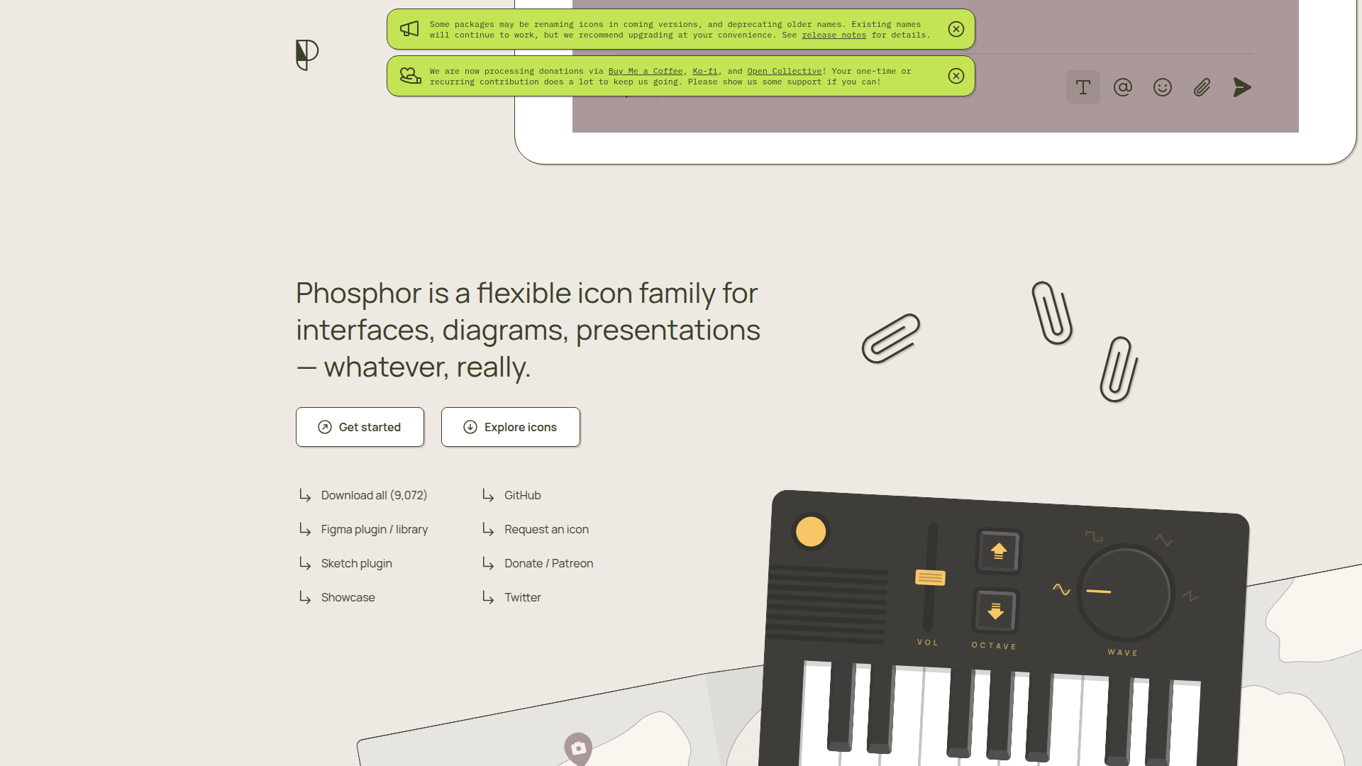
What is Phosphor Icons
Phosphor Icons is one of the most modern and comprehensive icon libraries I've encountered. This icon system created by Helena Zhang and Tobias Fried is truly eye-opening. With 9,000+ meticulously designed icons, each icon provides 6 different styles: Thin, Light, Regular, Bold, Fill, Duotone. This diversity allows it to find suitable expression in various design scenarios. What impresses me most is its design consistency - even in such a massive icon library, every icon maintains a unified visual style. Plus the basic version is completely free, which is more than sufficient for many projects.
Homepage
How to use Phosphor Icons
In practice I use Phosphor in two ways: component packages for products, raw SVG for quick hacks.
Use in frameworks
- Install:
npm i phosphor-react(or Vue/Angular equivalents) - Import on demand: tree-shake friendly
- Tweak via props:
size,weight,color,duotone
Use raw SVG
- Pick on the website and copy the SVG
- Paste into code or Figma, adjust
stroke/fill
Team tips
- Agree on default weights (Thin/Regular/Bold) to keep consistency
- Maintain a shortlist of commonly used icons
Phosphor Icons Key Features
Six styles at hand
Thin / Light / Regular / Bold / Fill / Duotone for clear visual hierarchy.
9,000+ topics covered
From common to niche semantics so you rarely get stuck.
Engineering friendly
React/Vue/Angular components, TypeScript types, on-demand import and tree-shaking.
Rock-solid consistency
Unified stroke, proportion and rhythm even at massive scale.
Complete ecosystem
Figma plugins, font packs and APIs streamline design-to-dev.
Phosphor Icons Use Cases
Enterprise admin consoles
Unified styles for menus, statuses and chart glyphs.
Multi-brand, multi-platform
Switch weights/styles to fit Web, mobile and mini-apps.
Design systems
Turn frequent icons into tokens for efficient reuse.
Data-heavy UIs
Use Duotone/Fill for emphasis and easier scanning.
Phosphor Icons Pros & Cons
Pros
Extremely rich icon collection with comprehensive coverage
Six styles providing rich visual hierarchy
High design quality with unified modern style
Multi-framework support, developer-friendly
Relatively complete free version functionality
Continuous updates with active community
Provides complete development ecosystem
Suitable for large complex projects
Cons
Premium features require paid subscription
Large icon library may affect loading speed
Free version has certain usage restrictions
Relatively higher learning curve
Some style combinations may be overly complex
Phosphor Icons FAQ
Q1: What's the difference between free and paid versions?
Free version includes complete icon library and basic features, paid version ($12/month) provides more download formats, API access, advanced tools and commercial license.
Q2: How to use in React projects?
Install phosphor-react package, then import needed icon components. Supports tree-shaking optimization and TypeScript, can control styles and sizes through props.
Q3: What's the difference between the six icon styles?
Thin is thinnest for large sizes; Light is lighter for auxiliary info; Regular is standard weight; Bold is heavier for emphasis; Fill is filled style; Duotone has dual-tone effects.
Q4: Can icon colors be customized?
Yes! SVG format supports color customization through CSS. Component versions also support passing color parameters through props.
More about Icons
Views: - Visitors: -


